Descriptions
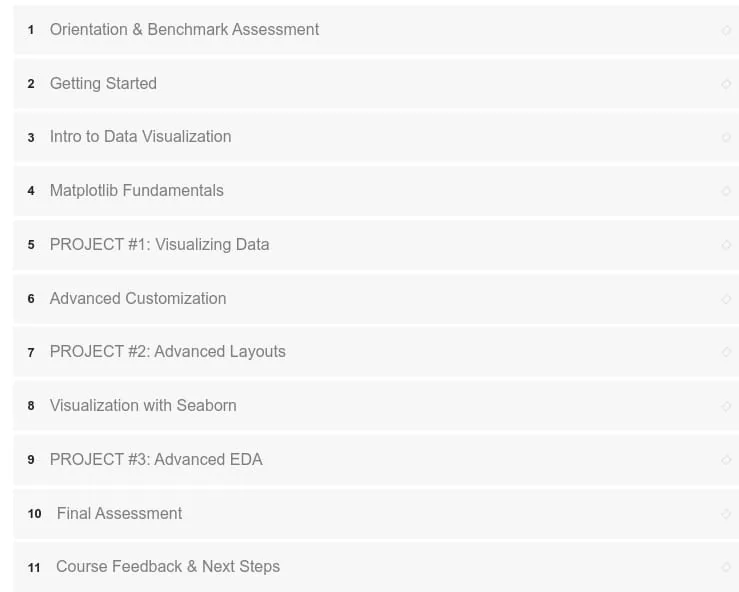
Data Visualization with Matplotlib & Seaborn, This is a hands-on, project-based course designed to help you learn two of Python’s most popular data visualization libraries: Matplotlib and Seaborn. We begin with visualization frameworks and best practices, review essential chart types and common mistakes, then dive into Matplotlib fundamentals—building and customizing line charts, bar charts, pies & donuts, scatterplots, histograms and more—covering figure components, formatting, subplots, GridSpec, style sheets and parameters. From there we introduce Seaborn, showing how to create both basic and advanced visuals such as box & violin plots, PairPlots, heatmaps, FacetGrids, and other statistical plots. Throughout the course you’ll work as a Consultant at Maven Consulting Group, applying techniques to real-world projects including hotel customer demographics, diamond ratings, coffee prices and automotive sales.
Course materials include on-demand video, hands-on exercises and projects so you can practice end-to-end workflows from visualization to reporting. The curriculum features guided projects and case studies, plus assessments to validate your skills: 7.5 hours on-demand video (12.5 CPE credits), 15 homework assignments (plus 3 course projects), 4 quizzes, and 2 skills assessments. If you’re a data scientist, BI analyst, data engineer or Python developer looking to add Matplotlib & Seaborn to your toolkit, this course is for you.
What you’ll learn
- Understand visualization frameworks, best practices, and common charting mistakes
- Build and customize Matplotlib charts (line, bar, pie/donut, scatter, histogram) and master figure components and formatting
- Use advanced Matplotlib features such as subplots, GridSpec, style sheets and parameter tuning
- Create advanced Seaborn visuals including box & violin plots, PairPlots, heatmaps, and FacetGrids
- Apply visualization techniques to real-world datasets and communicate insights effectively
Who this course is for
- Data scientists, data analysts, and BI professionals who want to build custom visuals and reports with Python
- Python developers seeking practical experience with Matplotlib & Seaborn
- Anyone interested in end-to-end data visualization workflows and hands-on projects
Specificatoin of Data Visualization with Matplotlib & Seaborn
- Publisher : Maven Analytics
- Teacher : Chris Bruehl
- Language : English
- Level : All Levels
- Duration : 12 hours and 30 minutes
Content of Data Visualization with Matplotlib & Seaborn

Requirements
- Jupyter Notebooks (free download, we’ll walk through the install)
- No advance preparation is required (basic familiarity with programming is a plus, but not a prerequisite)
Pictures

Sample Clip
Installation Guide
Extract the files and watch with your favorite player
Subtitle : English
Quality: 1080p
Download Links
Downloadly
Rapidgator
Password file(s): www.downloadly.ir
File size
1.23 GB