Description
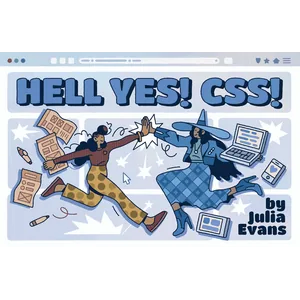
Hell Yes! CSS begins with the premise that CSS, despite its apparent simplicity, can be one of the most challenging parts of web development. Julia Evans admits that even after years of professional work, parts of CSS are still unclear to her, which is what inspired her to write this book. Rather than listing features, she focuses on “mental models.” The goal is to help readers understand how elements fit together on a page and why changing one feature can sometimes throw the entire layout of a site off-kilter.
In the following paragraphs, the book explores modern design tools like Flexbox and Grid, presenting them as life-saving solutions to old layout problems. The author emphasizes that understanding “Normal Flow” and the “Box Model” are the keys to success in CSS. The book is designed to take the reader out of the “randomly changing code until you get the result” mode and give them the confidence to implement their desired styles and fix appearance defects with logic and reasoning.
Book Features
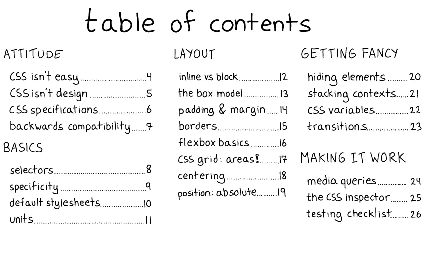
- In-depth training on the Box Model and how to calculate margins, padding, and borders.
- Exploring the difference between block and inline elements and their impact on layout.
- A comprehensive and visual guide to mastering Flexbox and Grid to create responsive designs.
- Explaining selector prioritization (Specificity) and how to overcome style conflicts.
- Learn new ways to align elements in the center of the page without the old hassles.
- Provides interactive examples and “Try Me” exercises to objectively understand strange CSS behaviors.
Book specifications
- Publisher: Julia Evans
- Instructor: Julia Evans
- Number of pages: 28
- Format: PDF
Headlines

Pictures

User Guide
Extract the file and run it with the appropriate software.
Download link
File(s) password: www.downloadly.ir
File size
16 MB