
Description
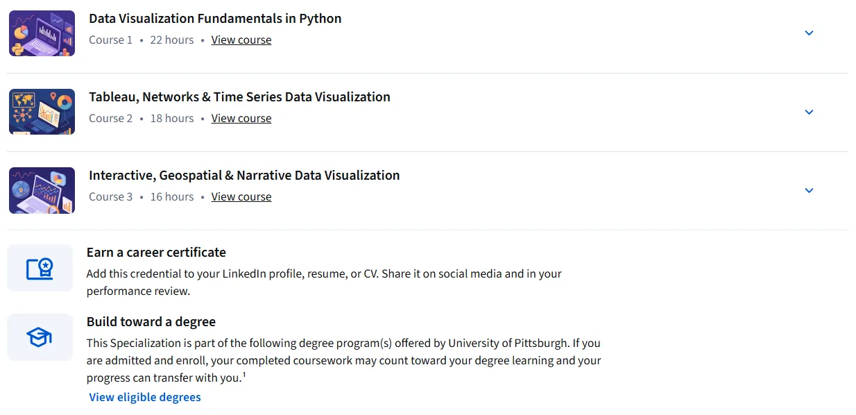
Data Visualization: Fundamentals to Interactive Storytelling Specialization. This course provides a comprehensive learning path to mastering modern data visualization tools and methods. By building a solid foundation in the fundamentals, the program prepares participants to create compelling and interactive data narratives. The course begins with a tutorial on data visualization in Python, teaching participants how to create basic and advanced charts using libraries such as Matplotlib, Seaborn, and Folium. The discussion then moves on to the Tableau platform and more advanced topics such as network visualization and time series data, where participants learn how to build interactive dashboards and analyze trends. In the final section, the focus is on specialized techniques, including creating impactful geographic maps and designing complex narrative visualizations. By combining real-world projects and hands-on exercises, this course strengthens the skills necessary to develop, analyze, and optimize data visualizations, ultimately enabling them to deliver deep insights and influence the decision-making process through effective data storytelling.
What you will learn
- Implement data visualization techniques and charts using Python libraries such as Matplotlib, Seaborn, and Folium.
- Create a variety of charts and graphs, including line, area, histogram, bar, pie, box, scatter, and bubble charts using Tableau.
- Develop advanced visualizations such as network diagrams, geographic maps, and interactive dashboards.
- Customize and optimize data visualizations to increase clarity and message delivery.
- You will gain skills in interactive data visualization, data storytelling, spatial analysis, network models, and data presentation.
This course is suitable for people who:
- Data analysts, data scientists, and data engineers looking to improve their visualization skills.
- Professionals who need to present data in a visually appealing and understandable way.
- Anyone who wants to create compelling and interactive stories using data.
- Students or researchers working on data analysis projects.
- Those interested in the fields of visualization, graphics, and design who want to apply these skills to the field of data.
Course Details: Data Visualization: Fundamentals to Interactive Storytelling Specialization
- Publisher: Coursera
- Instructor: PJ Grosse
- Education level: Intermediate
- Number of lessons: 92
- Training duration: 10 hours and 47 minutes
- Number of courses available: 3
Course topics

Course images

Sample course video
Installation Guide
After Extract, view with your favorite player.
Subtitles: English
Quality: 720p
Download link
File(s) password: www.downloadly.ir
File size
1.8 GB